Note: keep your widget WCAG-proof
It’s important that your widget remains accessible for everyone. Keep an eye on the following points when making changes:
• Make sure all text has sufficient color contrast with the background.
• Avoid gifs that are too fast or distracting.
It’s important that your widget remains accessible for everyone. Keep an eye on the following points when making changes:
• Make sure all text has sufficient color contrast with the background.
• Avoid gifs that are too fast or distracting.
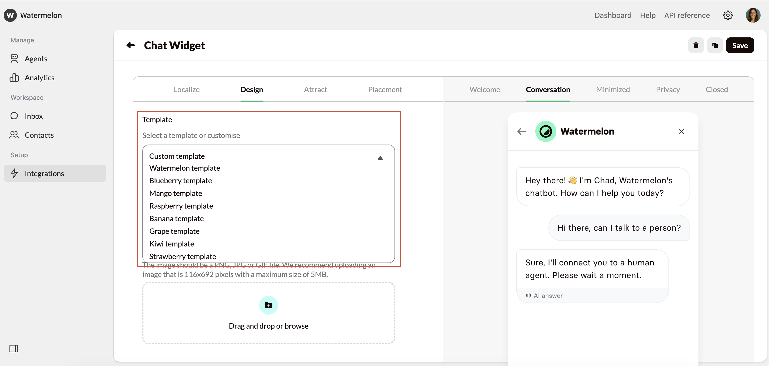
Your header
Change the header of your Widget here. You can either choose to add text, or add an image e.g. your logo. If you choose to upload your own image, this should be a PNG, JPG or GIF file. We recommend uploading an image that is 116x692 pixels with a maximum size of 5MB.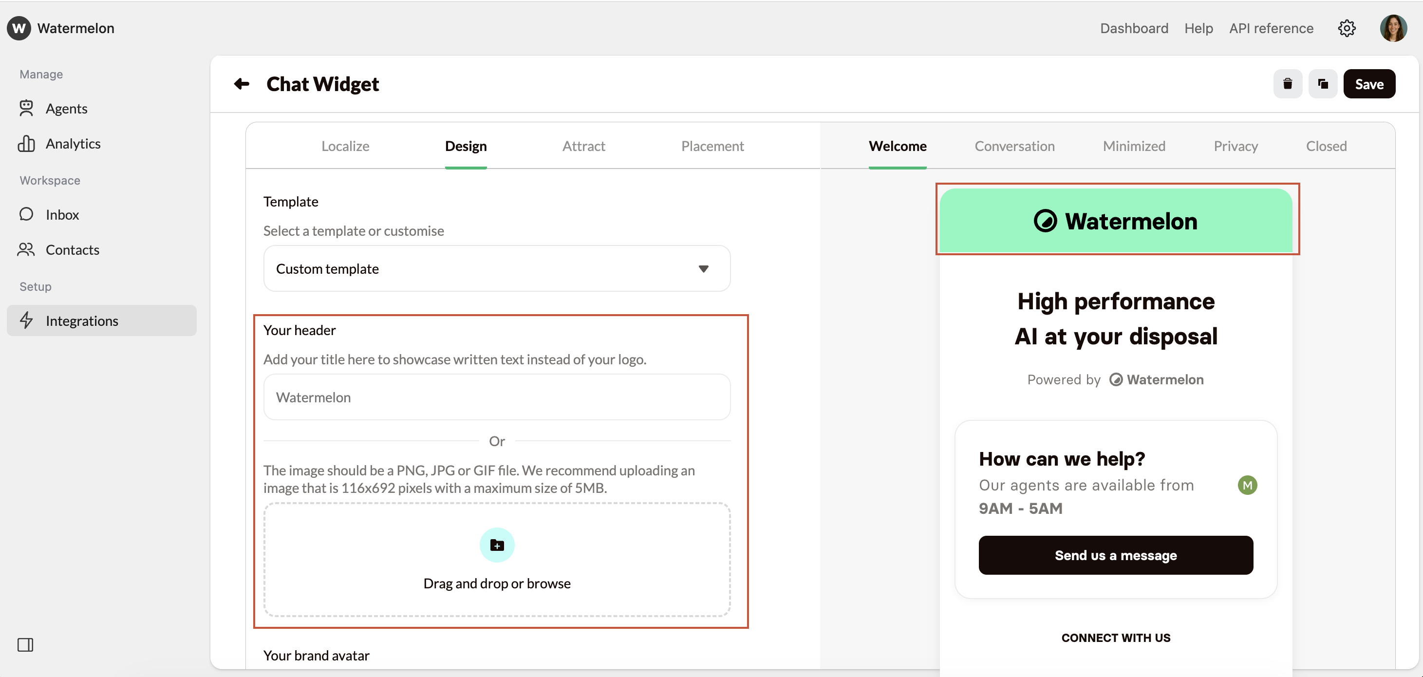
Your brand avatar
Your brand avatar will be shown when there is no AI Agent active on your chat widget, and the conversation hasn’t been assigned to an agent. The avatar should be a PNG, JPG or GIF file. We recommend uploading an image that is 500x500 pixels with a maximum size of 1MB.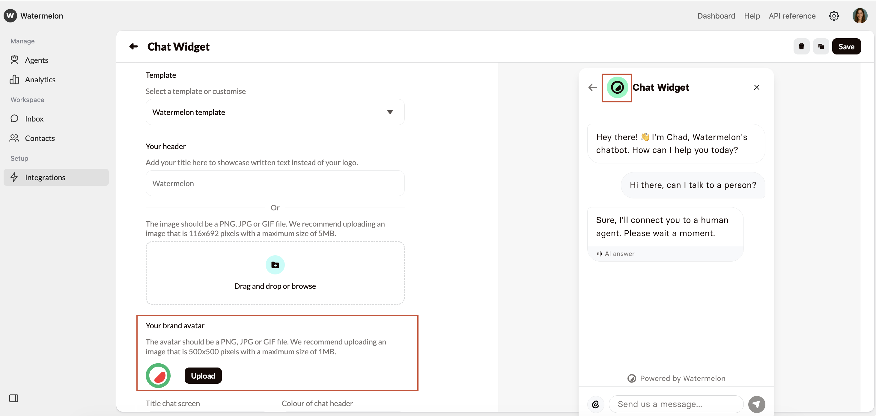
Widget design
In the Widget design section, you can change the colours of your widget. Click on the colour to select a colour, or add your colour code. You can add your colour code in HEX, RGB of HSL.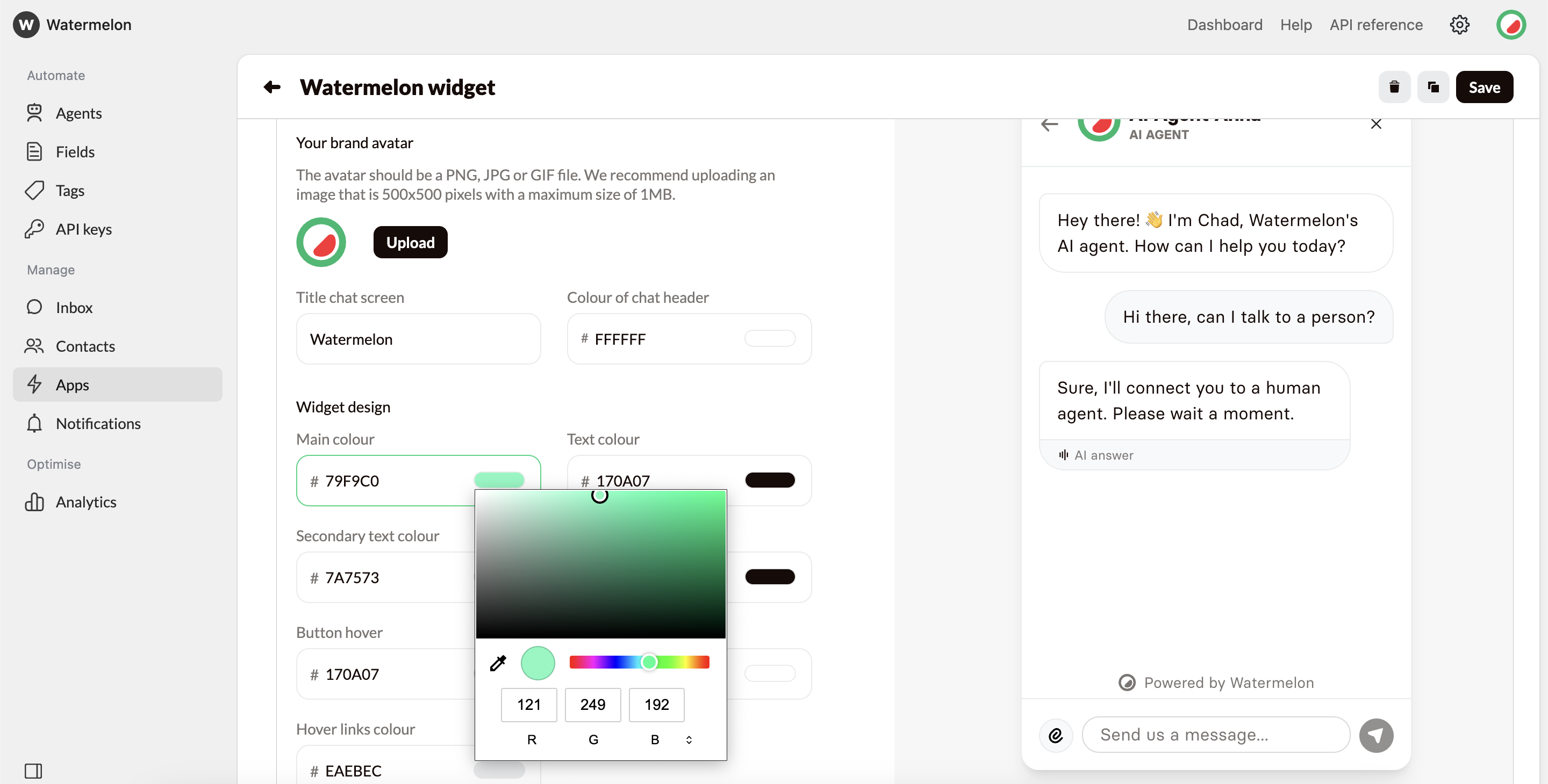
Chat element colours
The Chat element is the element in the middle of your Welcome/Closed screen. You can change the background and outline colours by clicking on the colour code.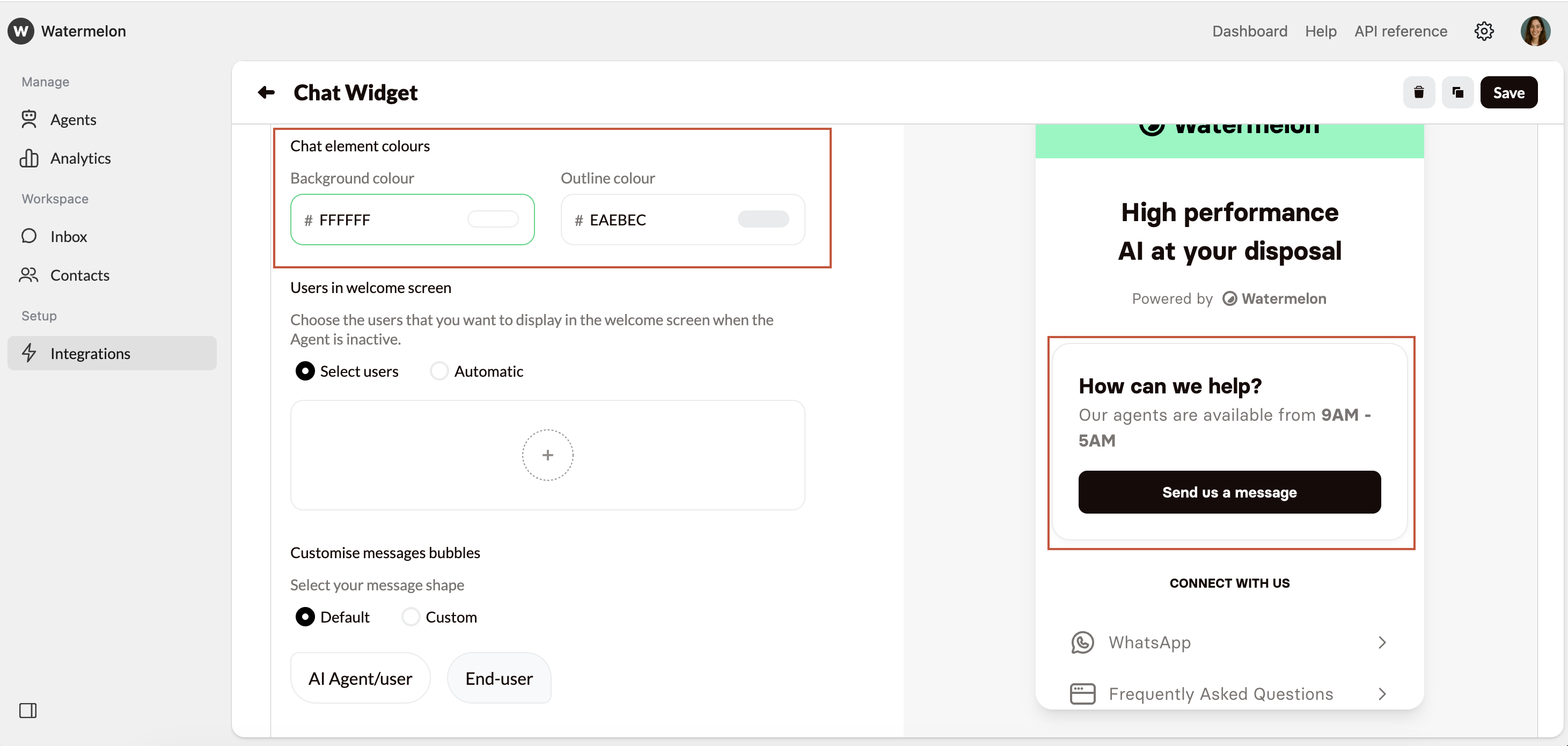
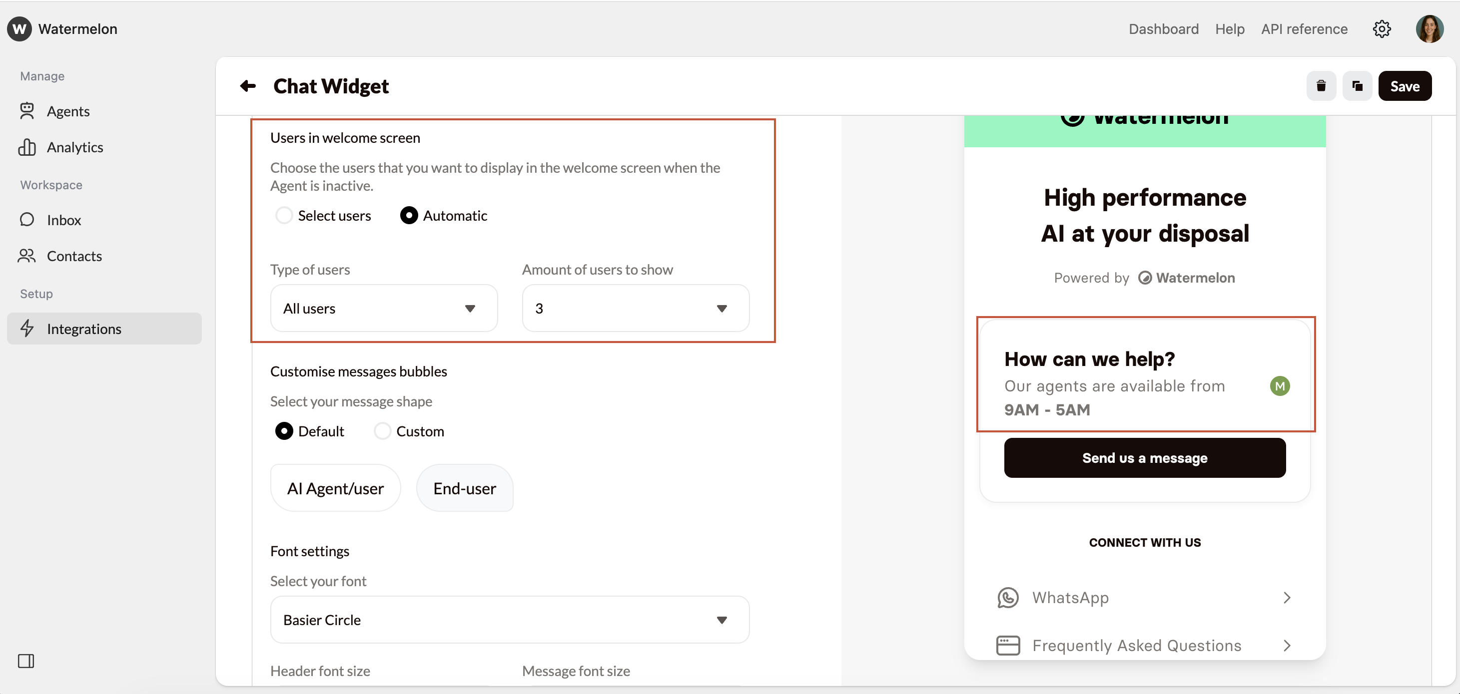
Users in welcome screen
Here, you can specify which users you want visible in the welcome screen when no AI Agent is active.- Select users: manually choose which user you want to display.
- Automatic: the users will randomly be picked.
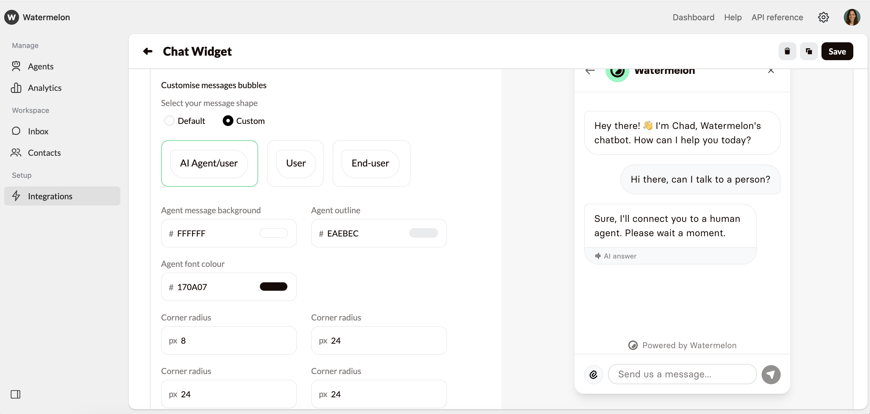
Customise messages bubbles
Under Customise message bubbles, you can choose how your message bubbles will look like. Choose Default for standard settings. In the Conversations preview on the right, you can see the changes you’re making.- Default: When choosing default, all bubbles will have standard styling.
- Custom: When you choose Custom, you can change the message shape and colours of the message bubbles for all users. Select AI Agent/User, User or End-user and style as per below:
- Message background:Here you can change the background colour of the message bubble. It is recommended to have different colours for the Agent, User and End-user so it is clear who sent which message.
- Outline:The outline color defines the edge of the bubble. Adjust it to help the message bubble stand out more clearly against the background.
- Font colour: The font colour is the colour of the text in the message bubble. Choose a colour which stands out from the background for good readability.
- Corner radius 4x:Corner radius is the measurement that determines how rounded the corners of a shape are. A higher corner radius makes the corners look softer and more curved, while a lower radius keeps them sharper and more square. Amend all corners as you wish.
Font settings
Open the Conversation or Welcome tab in the preview on the right.- Select your font: Choose the font of your branding, or a similar font to blend in with your company style. Choose a contradicting font to make your Chat Widget stand out more.
- Header font size: The header is the top text on your Welcome screen. By changing the font size, you fit a larger header.
- Message font size: This is the size of the text in the chat screen. Choose a size which fits your company style.
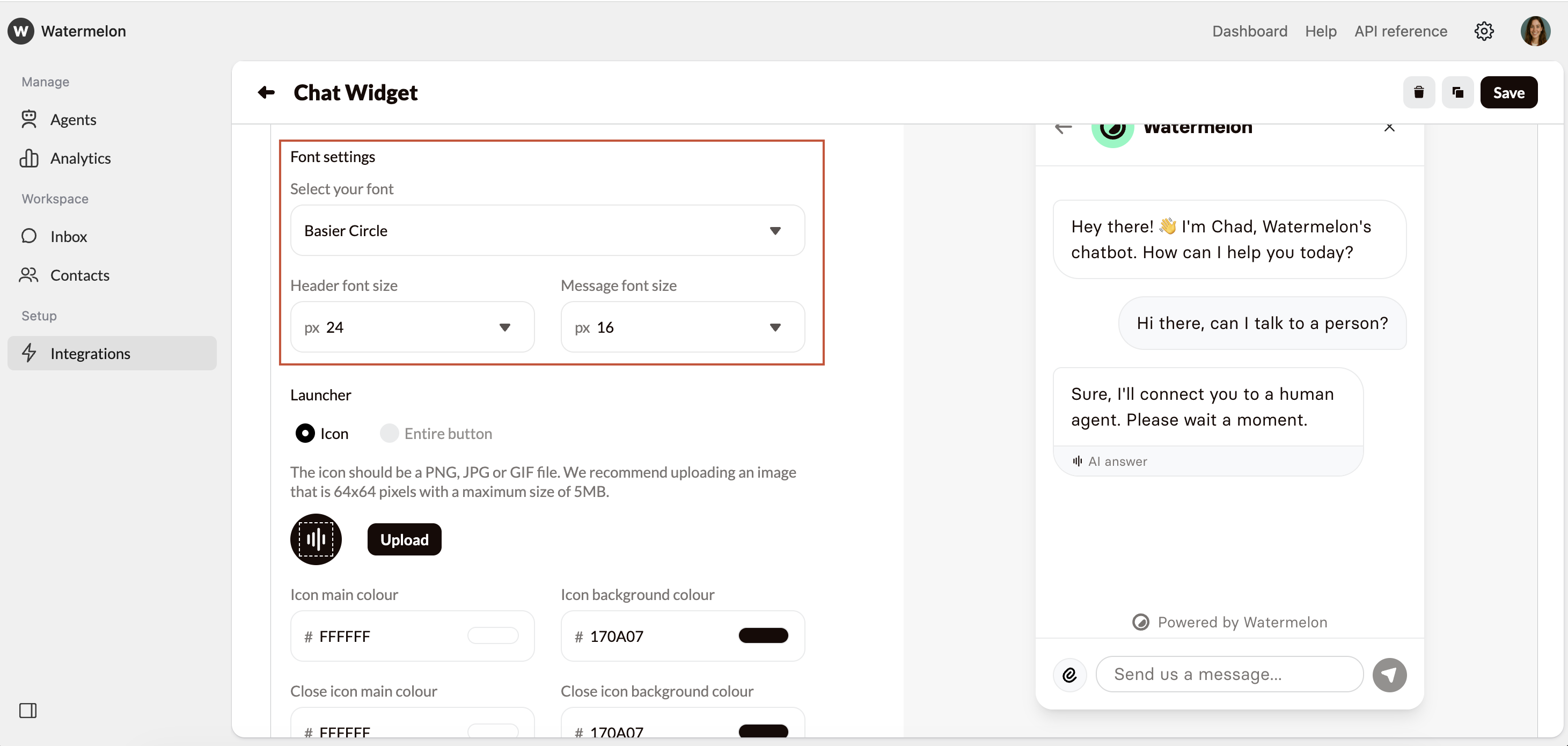
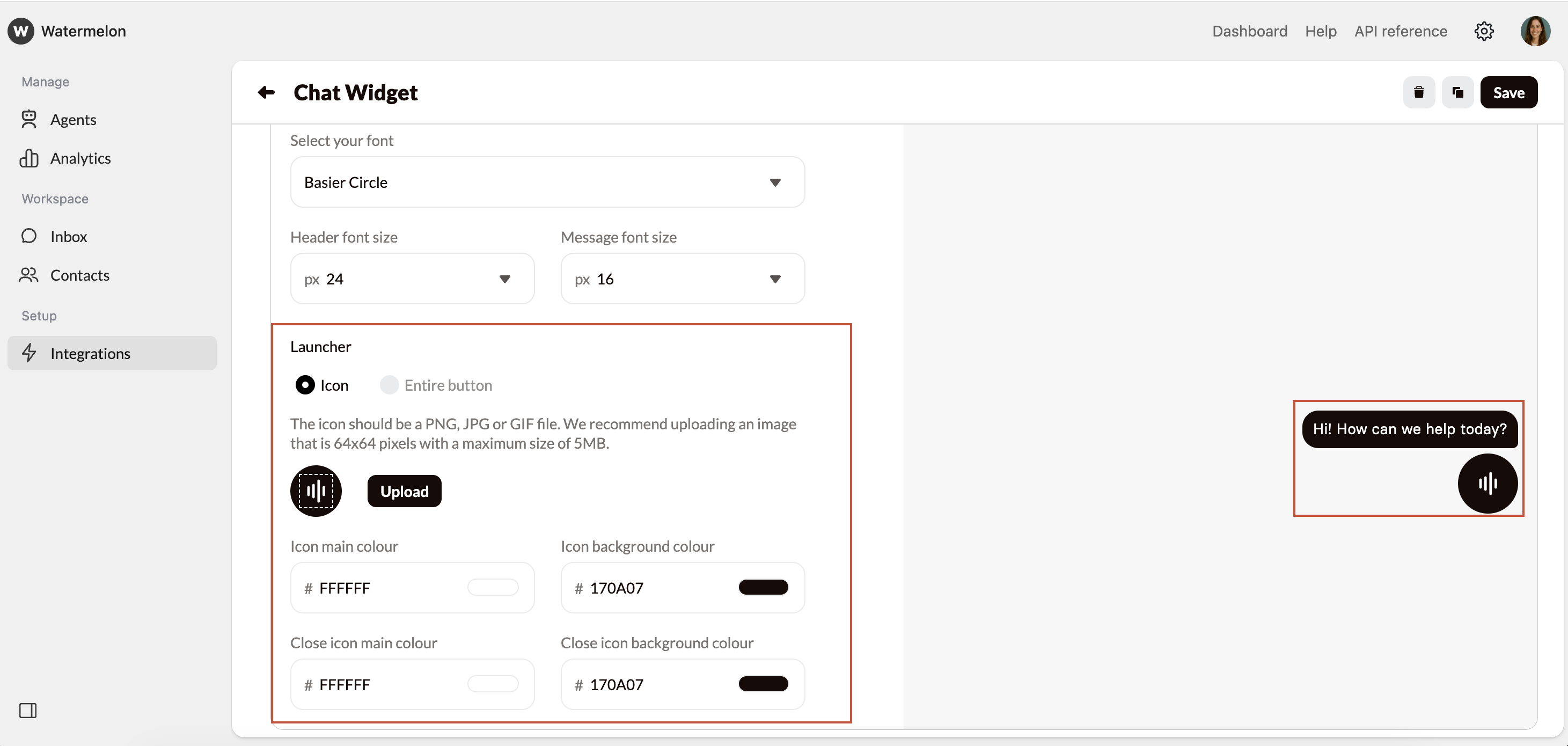
Launcher
The launcher is what shows on your website when your Agent is minimized. By clicking this, the widget will open. You can choose between:-
Icon: Use the default icon, or upload your own icon by clicking Upload.
The icon should be a PNG, JPG or GIF file. We recommend uploading an image that is 64x64 pixels with a maximum size of 5MB. -
Entire button: Choose entire button to upload your own image as the launcher by clicking Upload. The custom launcher should be a PNG, JPG or GIF file. We recommend uploading an image that is 112x112 pixels with a maximum size of 5MB.
Entire button is only available in Business and Enterprise licenses.
Colours of launcher
Here you can change the colours of the launcher. We recommend opening Minimized in the preview screen on the right, so you can see your changes immediately.- Icon main colour: This is the colour of the strips of the icon of the launcher and the text of the eye-catcher.
- Icon background colour: Here you can set the background colour of the Icon. It’s recommended to use a striking colour so the Widget will stand out on the website.
- Close icon mail colour: When the Chat Widget is open, the stripe icon will change into an arrow down. Choose a colour for the arrow.
- Close icon background colour: Choose a colour for the background of the icon for when the Widget is open.